Active Boards
Browse all active boardsLIVE
Public
Infinite
7 Artists
idk

sorry for so many boards.
LIVE
Public
Finite
1 Artists
Commissions Cover

Cover drawing for our commissions project on scratch!
Please refrain from drawing here! This is only for me an a friend.
Public
Infinite
sketchjam

Popular Boards
Browse all public boardsPublic
Infinite
yapieee

Do not draw too close to other people's drawings. Do not write HUGE inscriptions with advertisements or slogans.
Be a good person :)
Public
Infinite
sketchjam
Public
Infinite
🐱🔪

-NO DRAWING PORN. YOU WILL BE BANNED IF YOU DO
-artistic nudity is fine
-Don't draw over or erase other people's art
Public
Infinite
Beroonbhadowdrawtober

Welcome to 
Welcome to HelloPaint, the online collaboration tool for digital artists! With our browser-based web platform, draw together with your friends, no matter the distance. Join our global community of passionate artists of all skill levels and backgrounds.
HelloPaint is currently in early beta, and a collaboration between malmal.io and iScribble.net.
We combined iScribble's 12 year legacy with malmal.io's modern technology, and together, we look forward to inspiring the next generation of digital artists.
Thanks for being here- If you have any questions, concerns, or feedback, please get in touch at hello@hellopaint.io!
Gallery
Explore Gallery

40

A 4-person collab with @Mara, @cherero, @Star eater, and @Tint!
by
39

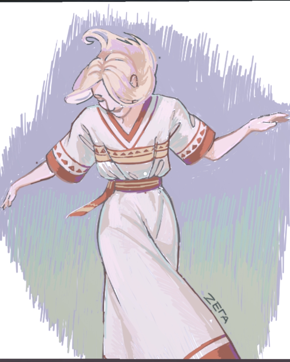
Anatomy has some problems and i refuse to do the tattoo, but this is my sweet little treat after not drawing for 5 months cuz depression got me bad
Character is from Blue Lock btw (spreading the gospel)
37


One piece
33

Pretend I finished it
33

i drew this like a couple of weeks ago but i got logged off and i thought it got deleted so im happy to see its still here cause this took a minute
29

:3
26
I love Miku sm
26
Ref from Pinterest
23


First drawing on here kinda scared but joker from persona 5
20


shork
by
18
Don't rlly like this one but hay ho
18

A (very) late drawing to celebrate the video game The Legend of Zelda: Breath of the Wild's 7th release date day or whatever!
16
i drew this to big so if you wanna see the rest you gonna have to visit the board
16